
Similar to our win projections, our fantasy projections are done through simulations.
When we simulate rounds for golfers, we’re also tracking fantasy points accrued during those rounds. Then, at the end of the simulation, the placement points are added in and we can rank players based on their fantasy performance, attaining a new fantasy leaderboard.
What we’re really interested in is not just average fantasy score for a golfer, but how often they “pop.” Because tournaments contain a highly variable number of golfers, we look at the percentage of time a golfer finishes in the top 10% of the field in fantasy points. This gives us a uniform baseline across tournaments.
The next step is introducing fantasy salary information into our analysis. We create a linear regression for salary and projected top 10% (pT10%) to create an expected top 10% (xT10%) for every golfer, and then use the difference in pT10% and xT10% to create a value metric.
Let’s use some players as an example.
| Player | Salary | pT10% | xT10% | Difference |
|---|---|---|---|---|
| Justin Thomas | 9,700 | 29.6 | 35.6 | -6.0 |
| Scottie Scheffler | 8,500 | 24.6 | 24.1 | 0.5 |
The chart shows why salary matters.
Looking at Thomas and Scheffler, we see that Thomas has a better chance of finishing in the top 10% in fantasy points than Scheffler does. But since Scheffler costs considerably less to insert into your lineup, his expected value is much lower. Scheffler actually returns a slightly positive value over expected, while Thomas returns a negative value.
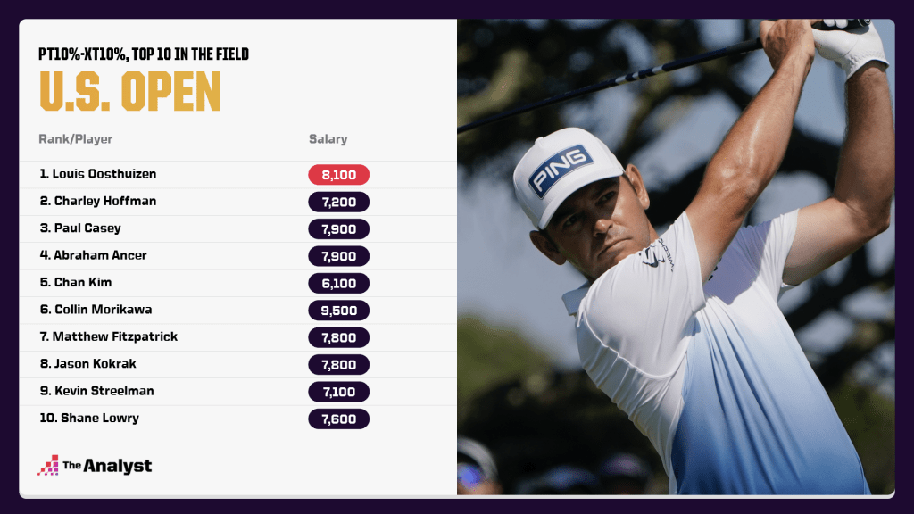
So who leads in pT10% – xT10%? Here are the top 10 in the field:
Why so many players in the $7,000 range? Well, there are more players to choose from here and the higher the salary, the more extreme your results have to be to return a strong value.
Ownership
Ownership is where some game theory comes into play. For DraftKings fantasy, particularly GPPs, the prizes are skewed heavily towards the top. To get to the top, the easiest way is to have the best lineup. However, the odds of having the optimal lineup for any given week is extremely small, and it becomes a game of picking the best golfers who are also owned in the fewest number of lineups.
Let’s say you have two players projected for the same pT10%. Player A is projected to be owned by 15% of the field and Player B is projected to be owned by just 5% of the field. In this example, Player B returns more value to you if he attains his top 10% than if Player A does, since you’re gaining ground on 95% of the field rather than 85% of the field.
Let’s look at this example.
| Player | Salary | pT10% | Value | pOwn | pT10% | New Value |
|---|---|---|---|---|---|---|
| Corey Conners | 8,200 | 28.1 | 6.9 | 6.7 | 21.5 | 7.9 |
| Jason Kokrak | 7,600 | 28.1 | 12.7 | 16.4 | 11.7 | 1.5 |
Both players have the same pT10%, but Kokrak is $600 cheaper. Using what we learned about value before, Kokrak is the higher value play. But what happens if we look at projected ownership? Kokrak is projected for almost double the ownership as Conners.
There are a myriad of ways to figure out ownership adjustments, but for the sake of simplicity let’s just subtract ownership from pT10%. As we did before, we can use a linear regression to create an expected pT10% – pOwn for each salary and then attain a new value for each golfer that encompasses projected performance, value to salary, and value to ownership.
In this case, both golfers remain positive plays, but Conners jumps ahead of Kokrak because of the lower ownership.
Design by Matt Sisneros.